©
Date
Jan 2026
Client
Teach For India
Industry
EdTech / Non-profit Education
Timeline
4 Months
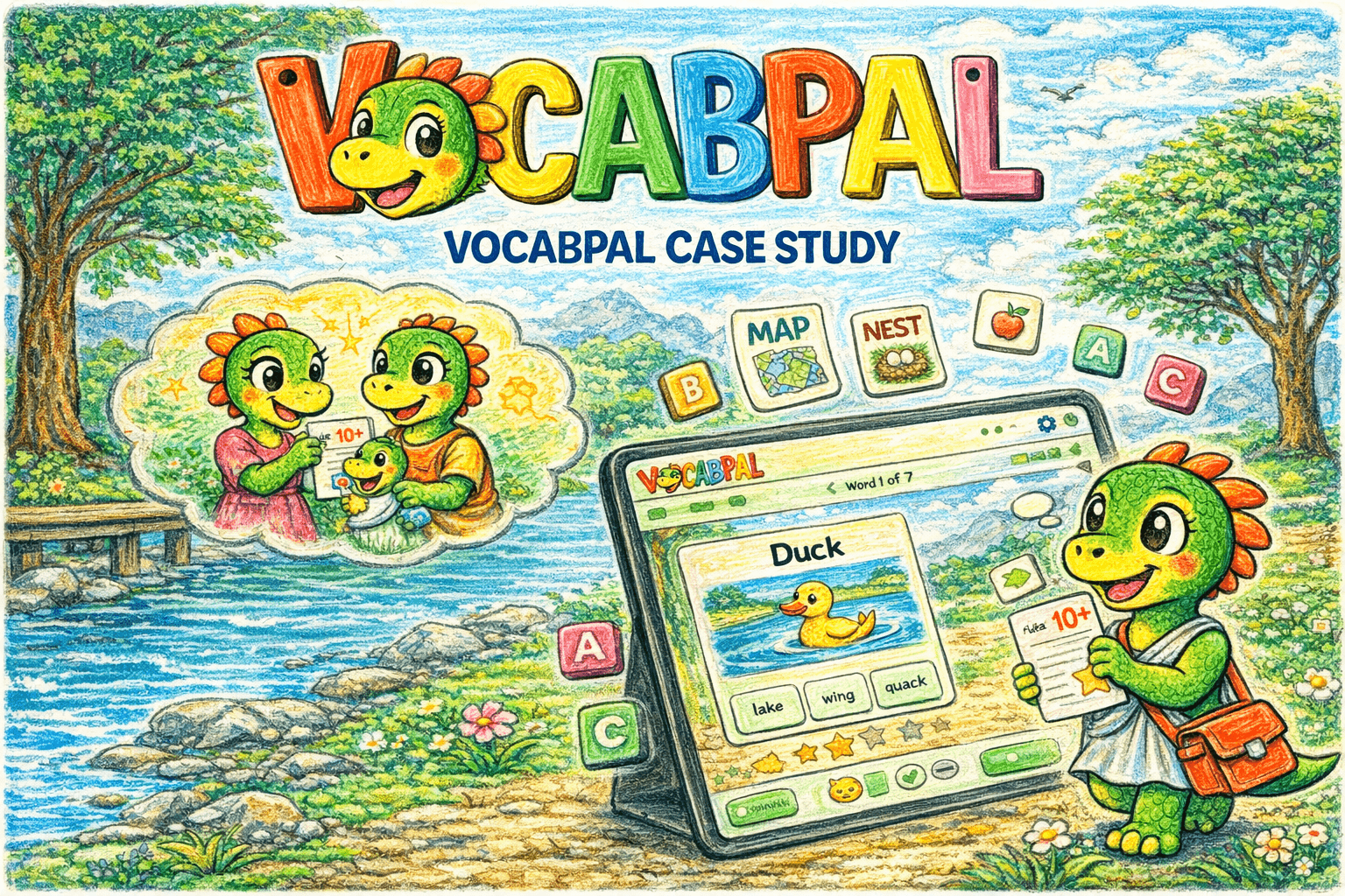
Inclusive design: Gender-agnostic visuals

The Challenge
One teacher. Forty-five students. No way to personalise.
A Teach for India fellow in Ahmedabad was watching her classroom split into three groups: students who were thriving, students who were average, and students who were falling behind. The below-average students weren't just struggling with the current curriculum. A Class 5 student performing below grade level couldn't read or write at a Class 2 standard. The teacher wanted to focus on lifting the lowest-performing students. But with 40–45 students per class, she had no mechanism to personalise instruction. Every student got the same lesson, the same homework, the same weekly test. The students who didn't grasp a concept went home, couldn't get help (parents were often time-poor or not English-literate themselves), came back the next day with incomplete work, and gradually disengaged. The existing assessment cycle (weekly tests, monthly tests, quarterly exams) measured what was taught, not what each student actually understood. It told the teacher who passed, but not why someone failed or what specific gap needed closing. 25% of the class was performing below grade level. Hiring additional teaching support wasn't an option as budget was near zero, and the schools depended entirely on Teach for India and its supporters.
MCQ: Child-friendly UI

Teacher dashboard
Mapping The Lifecycle
The gap wasn't in the classroom. It was in the space between class and home.
I mapped the full learning lifecycle from two perspectives: what the student experiences and what the teacher sees. From the student's perspective, the cycle looked like this: attend class → receive the same instruction as everyone → go home → attempt homework without support → struggle or skip it → return the next day → receive the same instruction again. Each time a student couldn't complete their work, their confidence dropped. Each time their confidence dropped, their engagement in class dropped further. A disengagement spiral that accelerated with every cycle. From the teacher's perspective, she could prepare different teaching approaches for core topics, but each approach was delivered to the entire class at once. There was no way to know which students needed which kind of support. Weekly tests told her the score, but not the shape of each student's gap. The core breakdown was in the space between school and home. Students had no support system for revision, no adaptive mechanism to meet them at their level, and no feedback loop that connected their individual performance back to the teacher in a useful way. This reframed the project. The solution wasn't another teaching method or another test. It was a supplementary tool that could sit in that gap identifying each student's challenge level, adapting to it, and giving the teacher actionable data about where each student actually was. There's a well-documented principle in learning science: if a challenge is too difficult, the student disengages; if it's too easy, they disengage. Finding the sweet spot (the zone where effort is rewarded with progress) is what keeps students learning. The problem was that the teacher had no way to find that sweet spot for each of 45 students. That became the design brief.
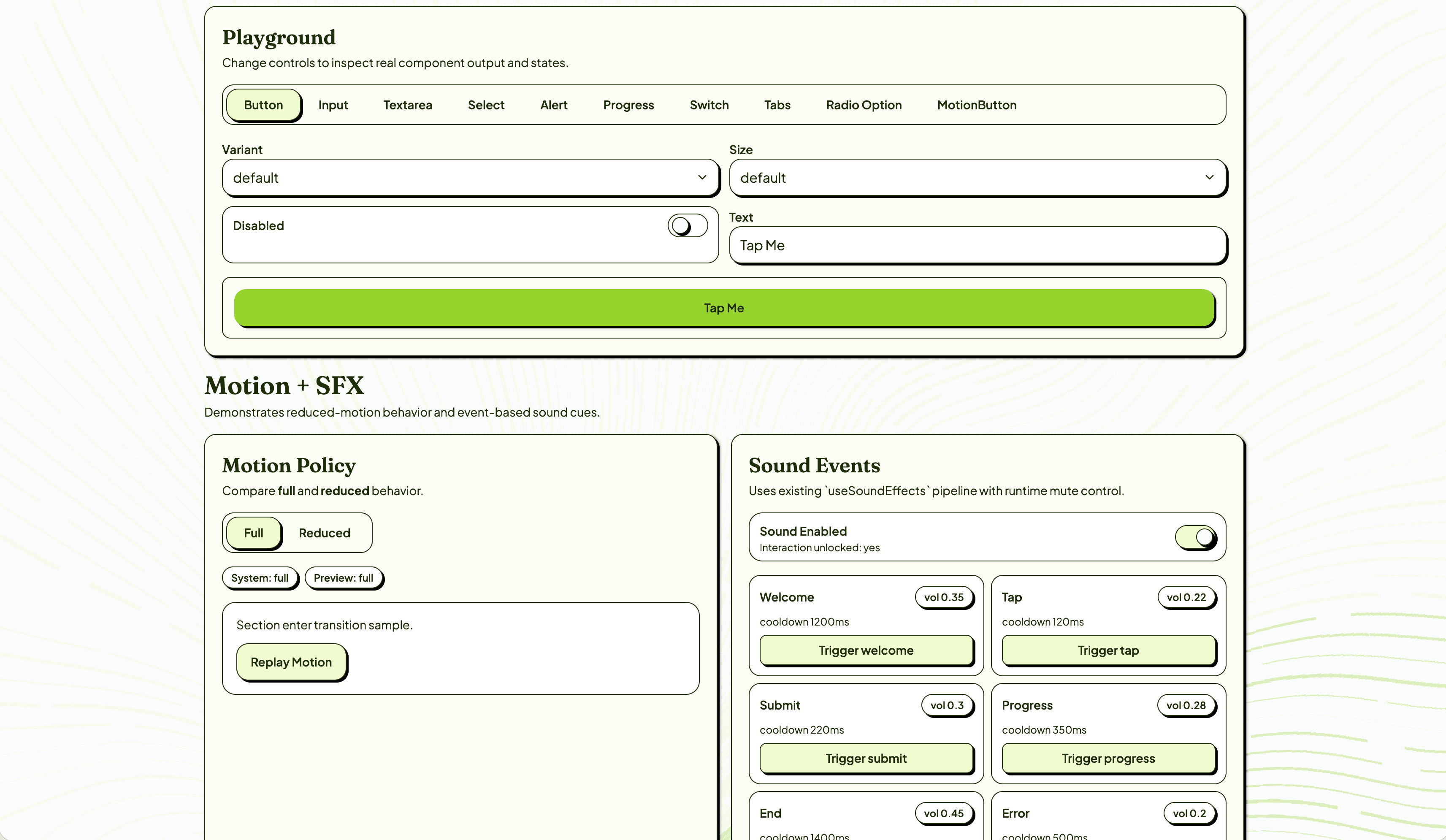
Design system

Design System Playground
The Solution
A 5-stage reading scale that finds each student's level in 10 questions.
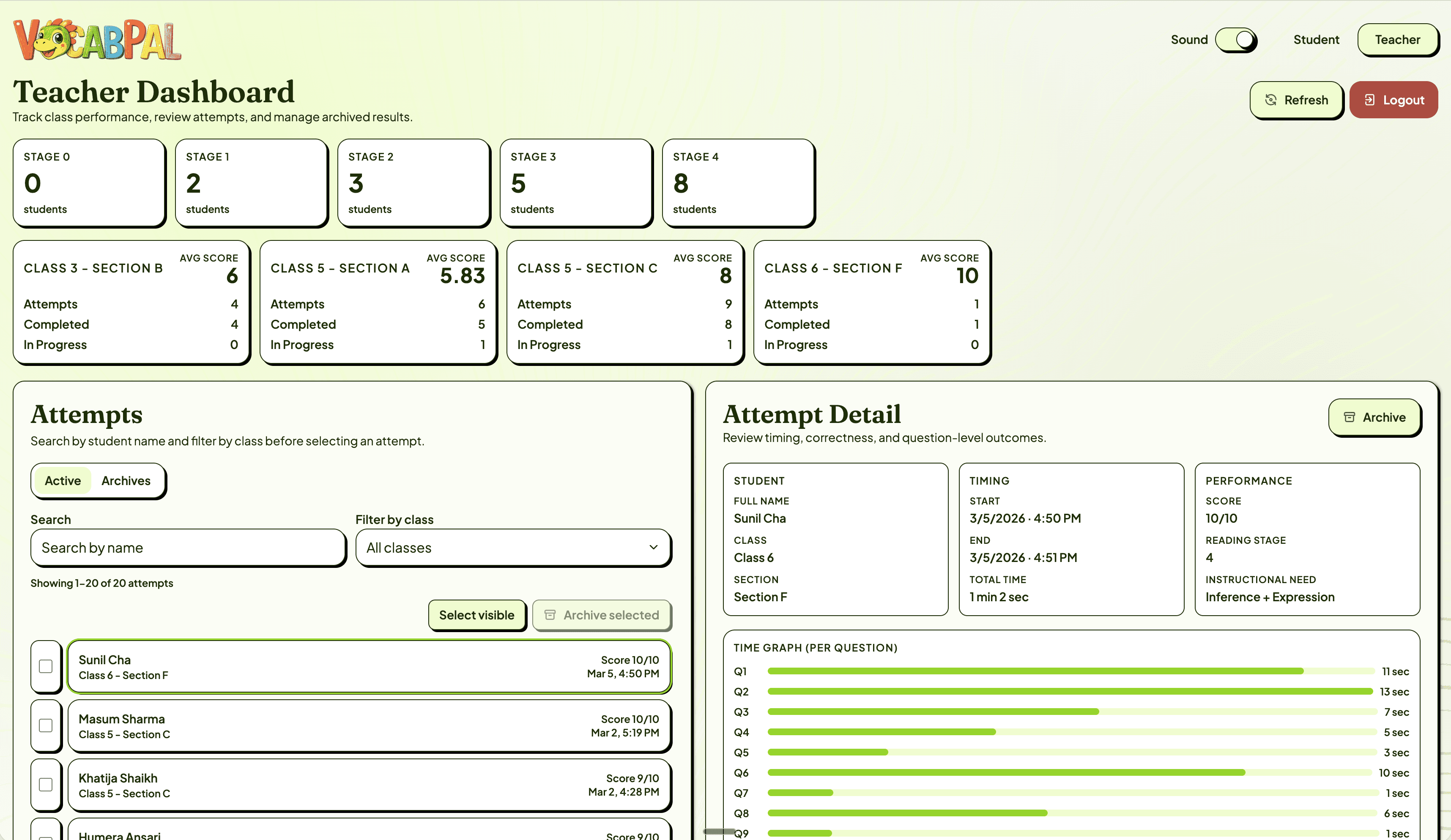
I designed a baseline assessment structured around a 5-stage reading progression — from pre-emergent sound awareness (Stage 0) through word reading, sentence fluency, paragraph comprehension, to inference and expression (Stage 4). Each stage maps to a specific instructional need, so the teacher doesn't just get a score — she gets a clear next step for each student. The baseline test is 10 questions, 2 per stage, mixing recognition tasks (MCQ, audio matching) with production tasks (typing dictated words). As a student answers correctly, the difficulty increases. Two consecutive wrong answers ends the test — the app has found their ceiling. A scoring matrix assigns each student to a stage with a corresponding instructional need. The student experience was designed for the constraints of these classrooms: 1. Child-friendly UI where every tap, every response, is reinforced with visual and audio cues. Text-to-speech uses a natural female Indian English voice so pronunciation matches what students hear in class. Gamification through star collection — one star per correct answer — with micro-animations that make progress feel tangible. Pacing that feels natural, not rushed. The app was designed to run on older tablets with limited connectivity. 2. Some students found the visual design so engaging that they started drawing their own versions of the characters. Others described it as feeling like a game. Not one student in the Phase 1 test skipped any of the work. The teacher dashboard surfaces what was previously invisible: Students grouped by reading stage across classes and sections. Average scores per class with drill-down into individual attempts. Time-per-question data that reveals not just correctness but confidence: two students might both answer correctly, but one taking 13 seconds and the other taking 1 second tells the teacher something different about their readiness. Question-level breakdown showing result, time, and answer for each item. For the first time, the teacher can look at her class and see exactly which students need phonics work, which need sentence fluency practice, and which are ready for inference-level challenges.
By the numbers
More projects